Story By
ZACHARY BARNETT
Photos By
TUCK FAUNTLEROY
ARCHITECTURE + INTERIOR DESIGN
MESSANA O’RORKE
MESSANAORORKE.COM
ANKENY ARCHITECTURE & DESIGN
ANKENYARCHITECTURE.COM
CONSTRUCTION
TWO OCEAN BUILDERS
TWOOCEANBUILDERS.COM
HOME AUTOMATION
JACKSON HOLE AV
JACKSONHOLEAV.COM
CABINETRY & CUSTOM MILLWORK
WILLOW CREEK WOODWORKS
WILLOWCW.COM
THE HUDSON COMPANY
THEHUDSONCO.COM
are always other ideas, new points of view and design options. Take minimalism, for instance.
“Not only are you working in limited space,” says Brian Messana,
of the New York City firm Messana O’Rorke, which developed its minimalist approach designing apartments and lofts in Manhattan, “but you’re choreographing how that space will be used and seeing what doesn’t need to be there. The lessons we learned were very much about form and function and what the intention is. Minimalism for us has become an expression of giving each thing the space to have meaning.”
First things first: Minimalism is complex. It does not abandon function, but rather embraces it through masterstrokes of clean, unfettered lines.
The Imagist poets of the early 20th century felt the same. As they sought a deeper clarity of expression, excess verbiage had to go. Things were no longer decoration but the very essence, the power. And what gave things this power was the removal of the extraneous. Less became more.

And then composer Claude Debussy took this concept a step further when he suggested that music was not the notes but “the space between.” When Messana and partner Toby O’Rorke were contracted by Brian’s brother, Mark, and sister-in-law, Ann, to design a house here in Jackson Hole, these ideas were very much in play. “As we began talking about what this house could be,” recounts Mark, “we saw it as a gathering place for family and friends—not about stuff and clutter and how to store it all. We wanted the attention to be on us and our time together, and the making of memories.”
And so the Messanas began methodically assembling a team, first by pairing Brian with local architect Shawn Ankeny, of Ankeny Architecture and Design, both because of her familiarity with area building codes, construction details and industry workers, and because of her growing reputation as a brilliant collaborator and architect. Next, because of their meticulous attention to detail, a Two Ocean Builders team headed by Bobby Henninger and his foreman, Jesse Mitchell, were brought on, along with Jaxon Ching and his team at Willow Creek Woodworks, and Rich Ashburn, of Jackson Hole AV. Lastly, they reached out to Jamie Hammel at The Hudson Company for Brian’s very specific lumber needs.
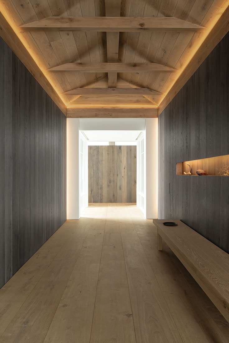
What followed was an ongoing dialogue about the balance between form and function. Messana O’Rorke was given the time to create a complete set of detailed drawings and adaptations while Ankeny, Henninger and Mitchell ensured that the design’s intent remained true throughout the course of the project.
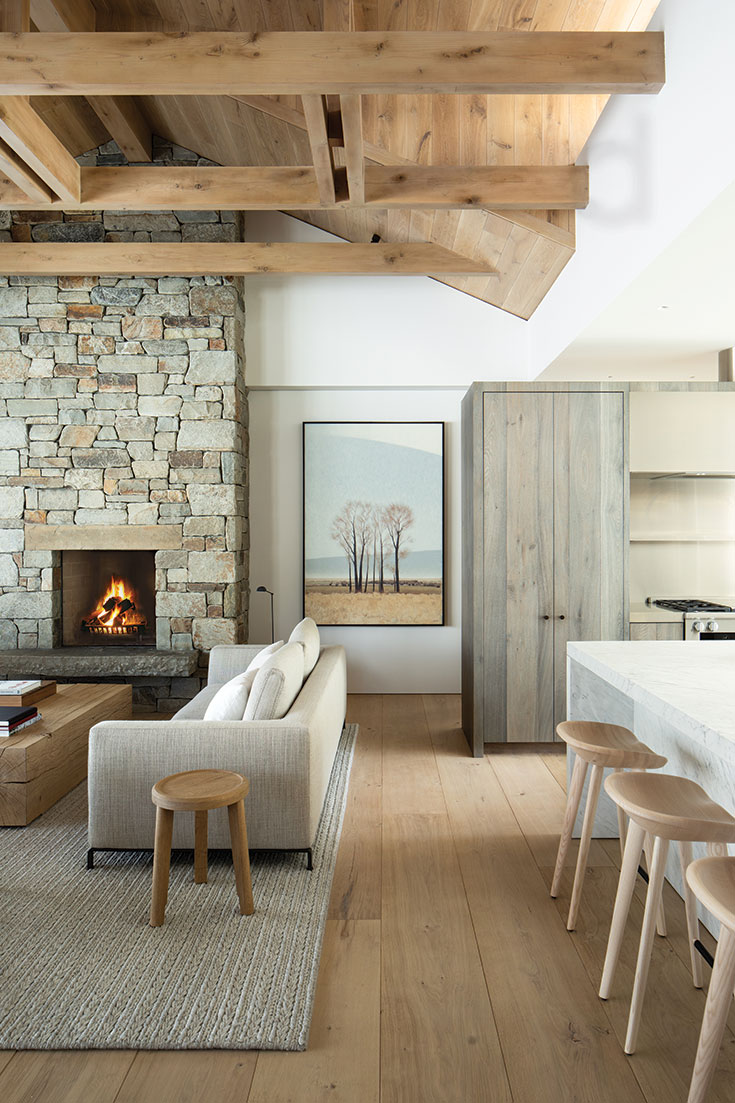
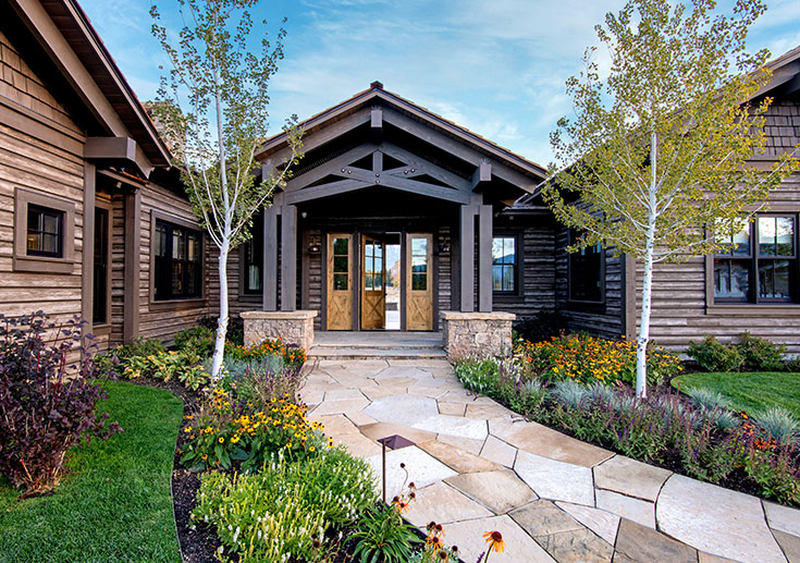
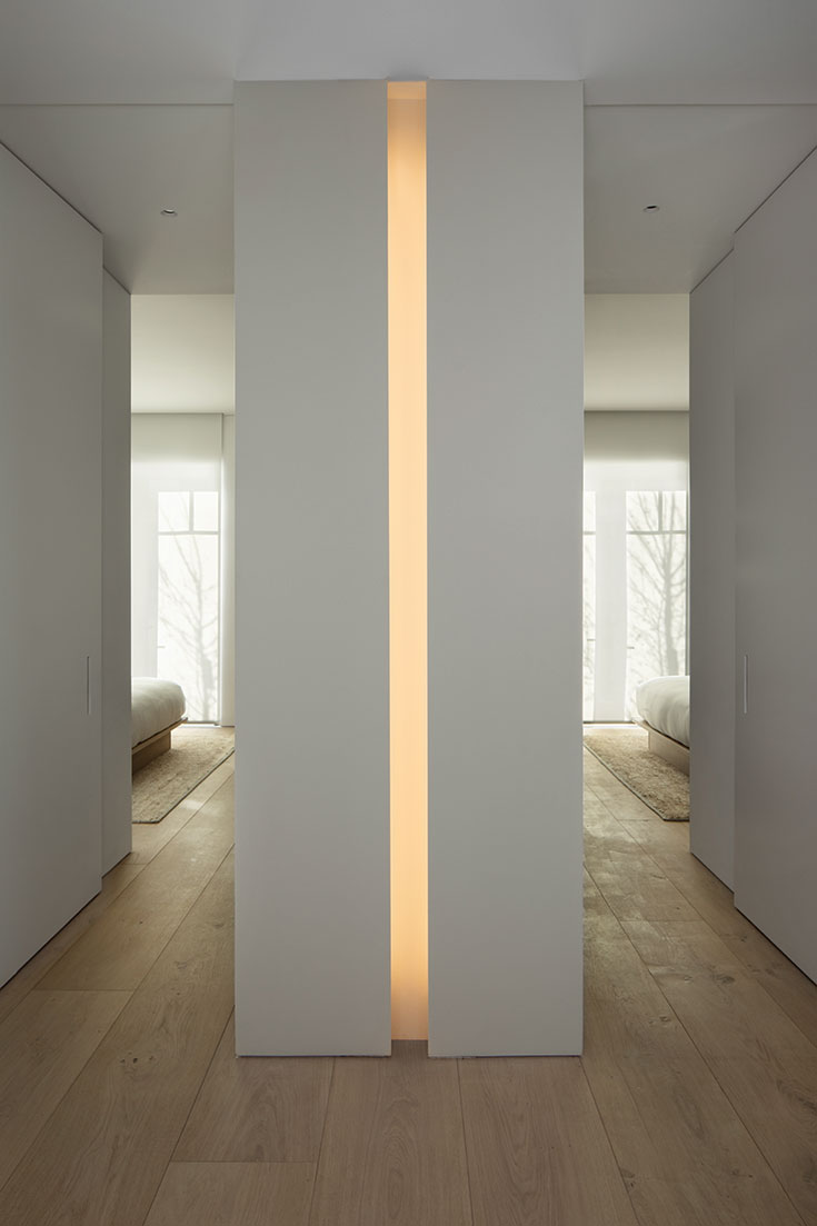
And this house is very much about the function of beauty, the details you see and the ones you don’t. The vertical pocket lights hidden from view and the receding pocket doors create a sense of flow. Overall, the home is a composition in four stanzas: wood-stone-wood-stone. Its four distinctly separate structures are connected by 6-foot glass passages, which become the breaths between the stanzas. What stands at the center are the great room and kitchen, creating the gathering space the Messanas desired. From all sides, the great room draws you in.
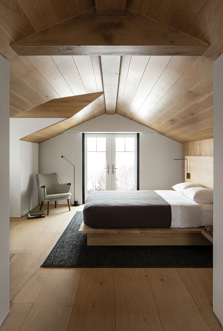
“From the technical aspect,” explains Ankeny, “the spacing between structures allowed us to break up the volume and avoid the accumulation of snow and ice in the roof valleys, while creating these spectacular light passages. From a poetic standpoint, the links provided these moments where you connect and feel the outdoors as you’re crossing from one structure to the next. These separations also make the house more intimate. Instead of one big mass, the four smaller volumes create a sense of wonder. Each one is different.”
But there is more to this—or less, actually. Throughout the home’s four stanzas runs a kind of tapping, a beat within the beat, a theme of quarter-inch reveals, reglets separating surfaces— surfaces to floor and surfaces to ceiling. The visual effect is of the ceiling floating above the walls, and the floor floating beneath. And, without baseboards or moldings, every detail has to be perfect.

“The result is very calming,” says Henninger. “It’s a difficult task to achieve this level of simplicity. Simple is complex. In a house like this, there aren’t a lot of other things to distract your eye besides the architecture, and so the architecture becomes the art. There can’t be flaws.”
“The designs were extremely difficult to achieve,” adds Ching. “The cabinetry, surfaces and veneers had to be perfect. If the plans called for a quarter-inch reveal, then that’s what we brought. Brian challenged us in a lot of ways. Having never worked with him before, we really enjoyed it.”
Hammel points out the Allagash veneers in the cabinetry and Ditch Plains French oak used in the flooring. “We originally brought it in as wet logs from Normandy,” he says. “Then we had to dry it to this area’s humidity level and mill it. That flooring was shrunk face, meaning it had a lot of movement in it, a lot of contour. And those were 13.5-inch-by-18-foot boards—a very rare order. Usually we ship boards in the 7-foot range.”
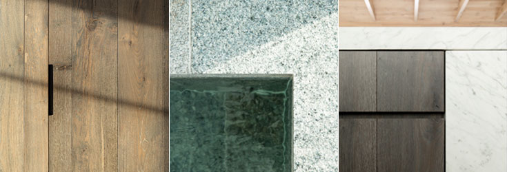
This minimalistic recessed door pull accentuates the clean lines featured throughout the house.
MIDDLE
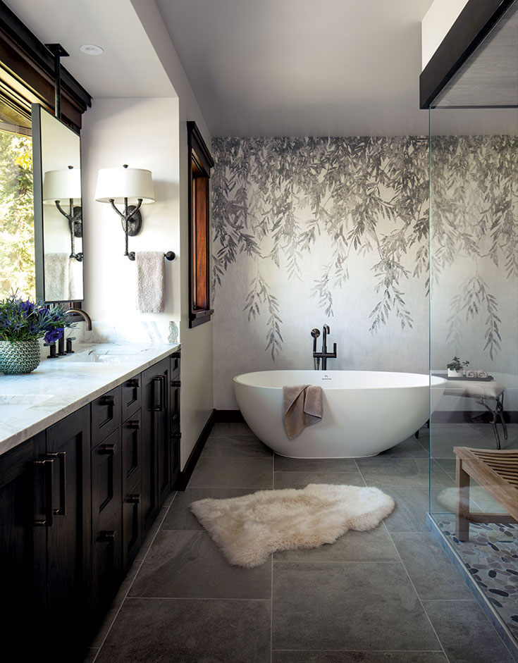
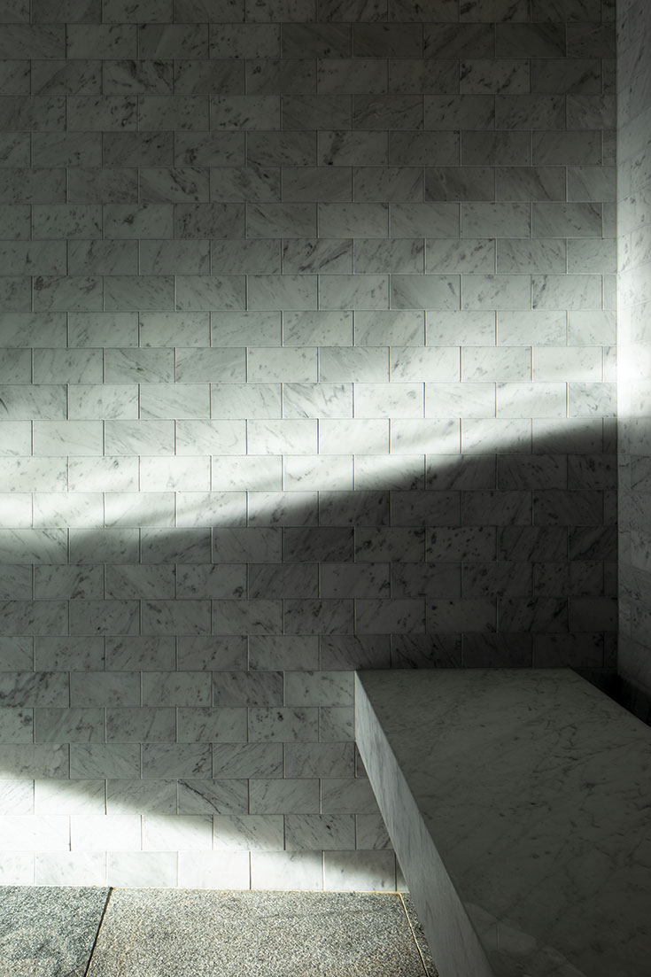
The granite floor seamlessly transitions to all surfaces of the spa.
RIGHT
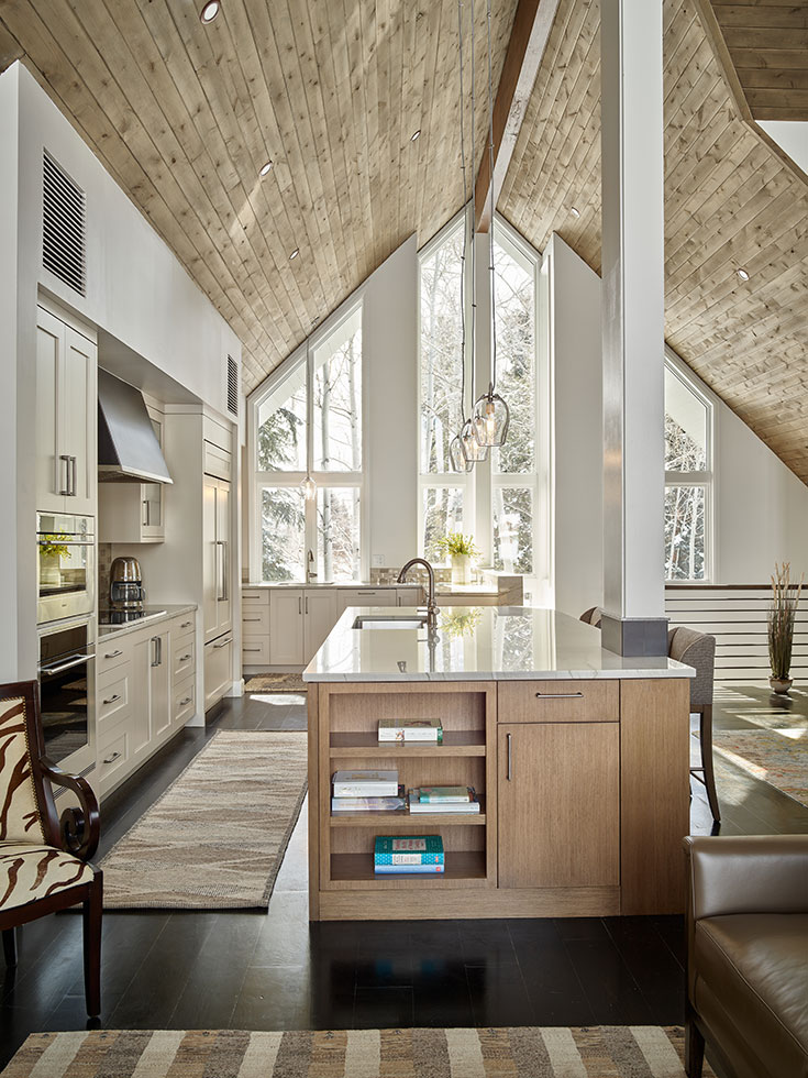
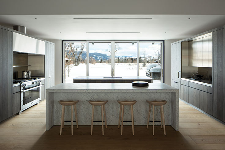
The kitchen island features Carrara stone and custom-stained oak cabinetry.
Not uncoincidentally, an 18-foot-wide expanse in the great room runs north to south into the kitchen and beyond without interruption. When the pocket doors are pushed back on both ends, the room suddenly becomes an indoor-outdoor canopy stretching out onto the terrace and joining with the master bedroom and guest rooms on either side. A long, paned clerestory across the gabled ceiling of the great room vents in light throughout.
The complexities of minimalism even extend to the operating systems, which are fully integrated and state-of-the-art, yet understated. “What stood out to us in assembling Mark’s electronics system,” remembers Ashburn, “was his level of passion. He wanted to do it right. You don’t see the speakers in the ceilings unless you really look. The TV in the master bedroom recedes into the floor so that it doesn’t detract from the views. It was all about the clean lines and the architecture.”
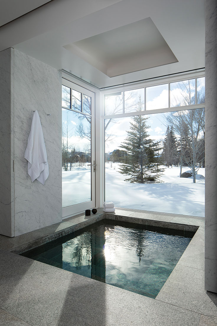
“Shawn would always say, ‘This is so zen,’” recalls Mark. “The whole team got along great, and the experience of working with them really added to our appreciation of the house.”
Summarizing the project, Henninger says, “Brian’s and Toby’s designs brought the best out of us. It seemed like we were being called upon to find our solutions and execute in every moment. It was a symphony of many players. We all had to come together and play note perfect, and we did just that.”


