A TETON PINES REMODEL BY WILLOW CREEK DESIGN GROUP RESULTS IN THE ULTIMATE SKI RETREAT.
Story
KATY NINER
Photos
DAVID AGNELLO
WILLOW CREEK DESIGN GROUP
INTERIOR DESIGN
WILLOWCREEKDG.COM
SERENITY BUILDERS
CONSTRUCTION
SERENITYINC.COM
the stories yet to be told by a home.
Honoring this plotline, Willow Creek Design Group—the team of senior designers and principals Colleen McFadden-Walls and Renée Crawford, with design associate Kathie Harrington—approach remodels with vision and passion. McFadden-Walls and Crawford, two longtime locals who recently came together as business partners, specialize in refreshing spaces that stray from the owner’s envisioned storyline. Clients come to them after decades spent in the same space, or when keen to transform a freshly acquired property.
In the latter category, a family of hardcore skiers approached the designers after purchasing a Teton Pines cluster home. New to the valley, they picked the Pines for its Westbank location—close to the world-class skiing at Jackson Hole Mountain Resort as well as the Teton Pines Country Club’s myriad activities and amenities, including the Arnold Palmer Signature golf course.
A Pines member herself, McFaddenWalls remodeled the 20,000-square-foot Clubhouse in 2016, so she knows the community well and looks forward to every opportunity to refresh the homes within the Westbank enclave. “We love doing work in the Pines,” she says.
With its original 1987 finishes, her client’s cluster home felt like a time capsule of the development’s origins. Buttery wood paneling lined the cathedral ceiling in the upstairs great room—a dated canopy over an ineffectual kitchen more suited to shortterm stays than jovial dinners with relatives and guests. Even the entry felt flat and unfulfilled decades on from its initial design intent.

Confident in WCDG’s capacity to reimagine the interior, McFadden-Walls recommended a team, which included Steve Stuchal of Serenity Builders, to realize the renovation. “We guide our clients from start to finish, helping with budget planning, serving as an owner’s rep, and hiring draftsmen and builders,” she says. “For this project, we helped our clients sort out the professionals necessary to get the job done. We pulled the team together.”
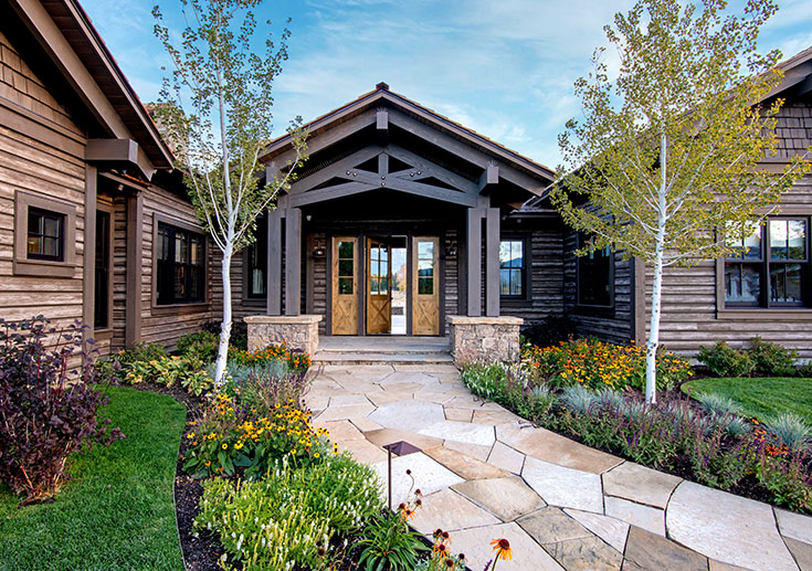
By reimagining core areas of the home, we were able to create a beautiful new entrance, a private office, the kitchen doubled in size, and a luxurious master bathroom.
— Colleen McFadden-Walls, interior designer
In general, the layout of the 3,211-square-foot house worked, save for the staircase. Natural light enlivened most rooms, thanks to tall picture windows. The bedrooms were well-placed, with the primary suite affording privacy upstairs and the remaining three on the ground level. “The cluster units have good bones,” Crawford says. “We worked within those architectural parameters and created a new space.”
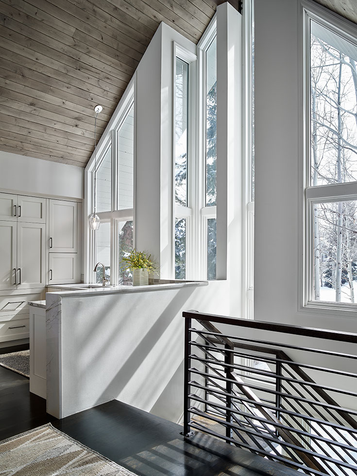
Amid the pros, the staircase remained a core con—too clumsy in its stepped ascent, too awkward in its position, too encroaching on both floors. By shifting the stairs closer to the entry, the new design makes the great room feel more open and less segmented, and the foyer became larger and more gracious.
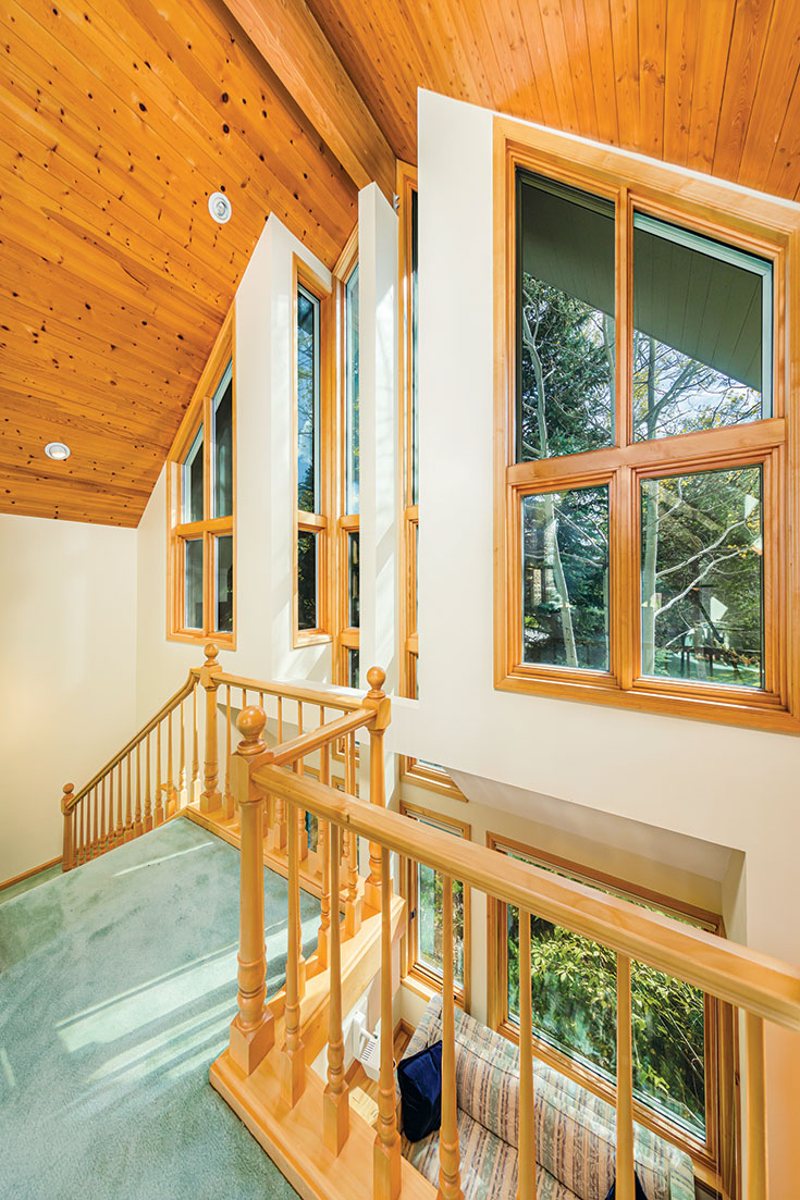
However, changing its course proved challenging; what seemed impossible at first—according to the structural engineer—became a puzzle for Stuchal to solve. Working from original drawings of the cluster units (kept by another owner whom Stuchal was helping remodel), he did some exploratory demo and figured out the load issues. “When you have the designers and the owners on board, and they have a vision for what they want their house to be and how they want it to perform for their family and their future relatives, you have to put in the time and figure it out,” he says.
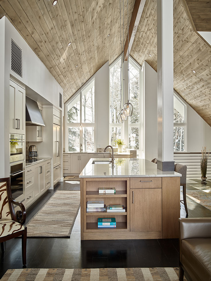
Now floating along the wall, the staircase edit added approximately 100 square feet on both levels in the form of a proper entry and private office downstairs and, upstairs, an expanded kitchen plus a new powder room and seasonal closet.
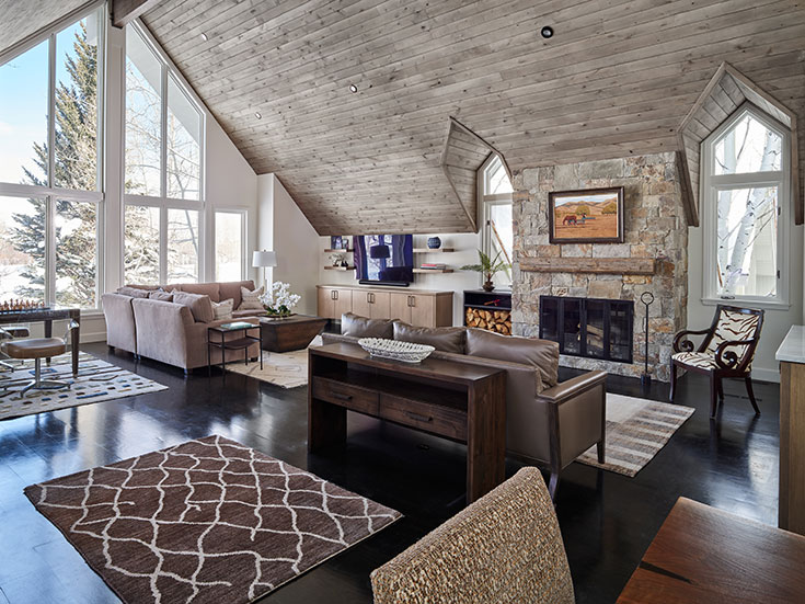
In its new state, a gourmet kitchen anchors the great room and flows into two sitting areas (oriented respectively to the fireplace and TV) and a game corner, all of which are capped by a soaring ceiling lined in tongue-and-groove alder stained light gray. Noting the family’s focus on winter occupancy (both husband and wife logged 100 days at the resort last ski season), McFadden-Walls recommended dark floors to contrast the snowy expanse so present from their panoramic perch. “Dark floors add another dimension to the space,” she says. “The space has so much natural light, the rooms could feel dwarfed by the outside.”
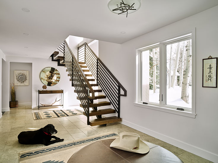
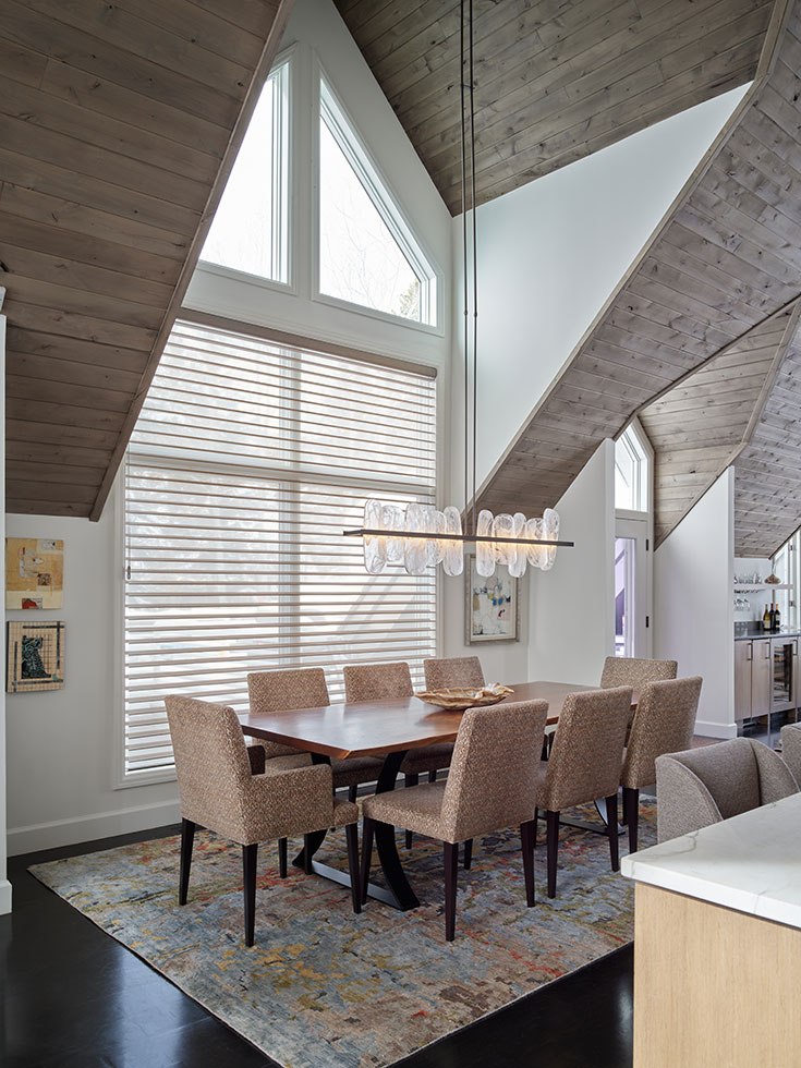
Building on this grounding foundation of stained, open-grained oak floors, McFadden-Walls and Crawford layered complementary new finishes from Chief Cliff stone, which frames the fireplace, to light custom cabinetry in the new kitchen and sleek drybar. Sculptural accents, like the Hubbardton Forge chandelier suspended above the dining table, add subtle drama. Abstract rugs from Kismet Rug Gallery lend texture.
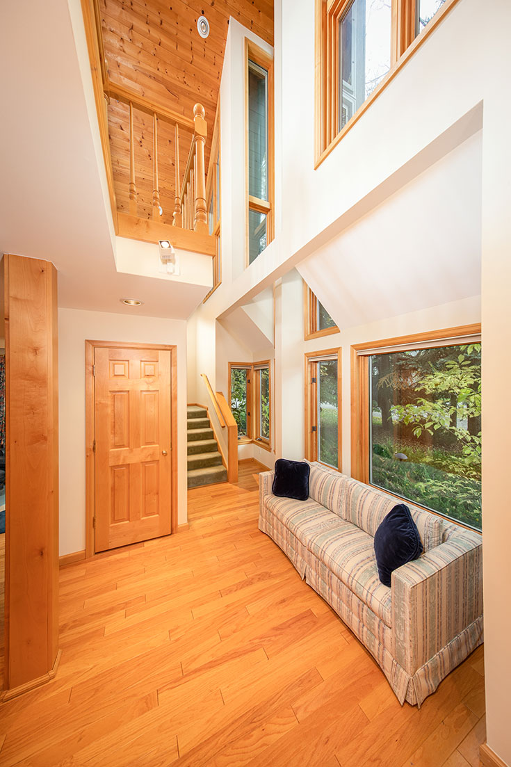
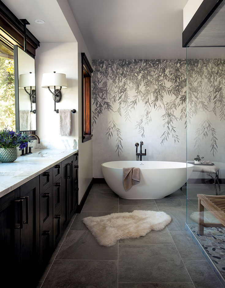
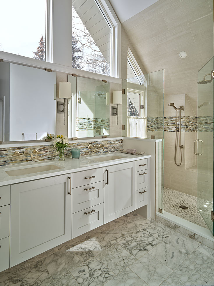
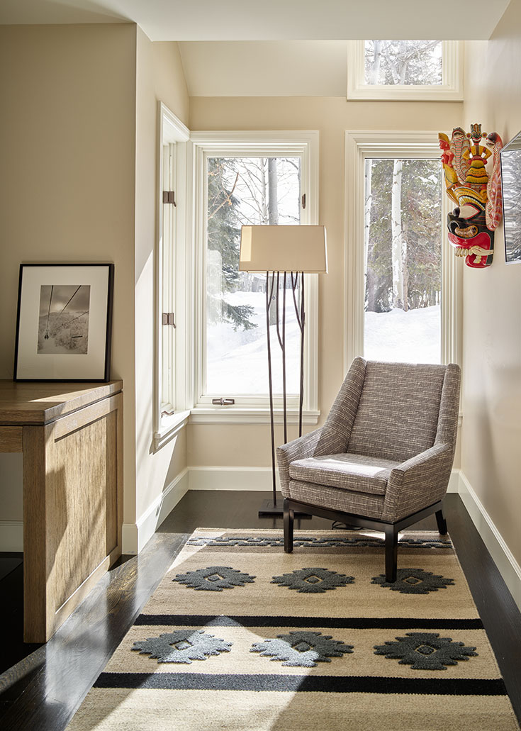
Addressing the choppiness of the bedrooms, the primary suite was opened up to allow for an airy primary bath. Built-in closets increased functionality, along with a dresser/desk combination creating another attractively hidden workspace. Now, when not skiing, the clients can work from home in panoramic privacy—a fairy tale ending for a fairway home. “The clusters all look the same from the outside, and they have the same layout,” Stuchal says. “This project transformed a dated cluster into a modernstyle residence. To me, the clusters can feel like condos or townhomes. This unit feels like a home.”
