+ Story by Dina Mishev
+ Photography by David Swift
Carney Logan Burke Architects
clbarchitects.com
HOME BUILDER
Two Ocean Builders
twooceanbuilders.com
Designed Interiors, LLC
designedinteriorsjh.com
LANDSCAPE
MountainScapes, Inc.
mountainscapesinc.com
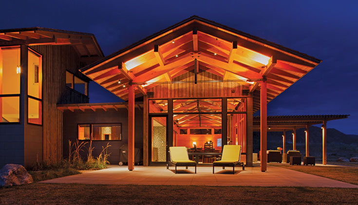
“Stark contemporary works well in California where it’s green year-round, but in Jackson Hole, where it’s winter half the year, you have to be careful,” says interior designer Kate Binger of Designed Interiors, LLC. “No amount of radiant heating can warm up cold design; no one wants to feel as if they’re freezing in their own home.”
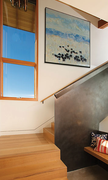
The placement of Theodore Waddell’s “Sheridan Angus” is deliberate, the blues of both sky and painting acting counterpoint to the rolled steel form of the stairwell wall.
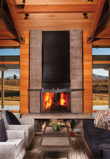
A site-cast concrete hearth with blackened steel anchors the main living pavilion while the space is defined by vertical grain fir paneling. Floor-to-ceiling glass showcases the unspoiled views of southern Jackson Hole. The iron-and-reclaimed-wood coffee table adds an earthy note with its wood grains reflected in the area rug. It’s balanced by the sleek nailhead detail on the sofa.
Award-winning Jackson-based architecture firm Carney Logan Burke worked with Binger, Two Ocean Builders and MountainScapes, Inc., on a contemporary five-acre property at the southern end of 3 Creek Ranch that, yes, has heated floors throughout, but is warm even without them. “The client asked for a really clean modern aesthetic, but was concerned it not be too cold,” says architect Kevin Burke, the principal on the project. Carney Logan Burke calls it “mountain modern.”
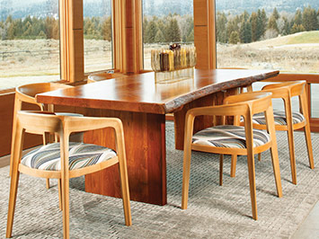
This organic, gracefully edged dining table plays well against the clean lines of the sleek dining chairs. Woven linen on the chair seats and a bamboo rug add warmth to elements of wood and concrete.
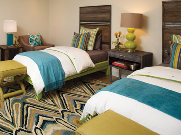
Kate Binger designed the custom headboards and side table, made locally, as juxtaposed elements to the concrete floors. Bright colors warm the space with a fun combination of pieces from her downtown store, dwelling.
“This style still has a close tie to our Western heritage—it uses today’s technologies and materials to reinterpret it,” Burke says. And here, Western heritage is given its full due before you even enter the home. “The landscape architect’s goal was to get the landscaping and house to match what was there before construction began,” says Sean Macauley, owner of MountainScapes, Inc. “And what was there before construction was sage, rabbitbrush and a bunch of native grass. You can’t get more Western than that.”
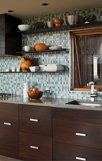
A sleek bank of sapele wood cabinets is punched up with sea-colored mosaic glass tile and modern, cantilevered, rolled-steel shelves.
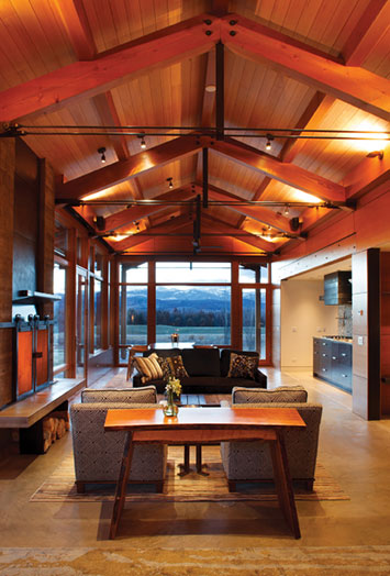
The 1,000-square-foot living area feels even larger with the dramatic views framed in floor-to-ceiling windows. Architect Kevin Burke refers to the style as “mountain modern,” where traditional rustic materials are used in a brilliantly contemporary style.
While this order sounds simple, it was anything but. “It is always hard to duplicate Mother Nature,” Macauley says. “Sometimes 400 trees and a ton of flowers are easier.” MountainScapes succeeded in executing a design that allows the structure itself to grab your attention.
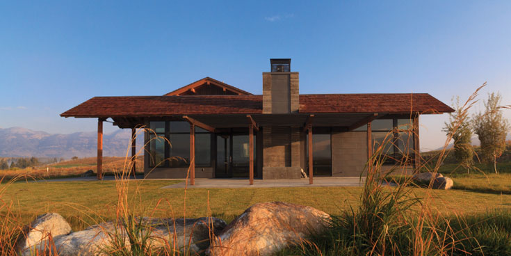
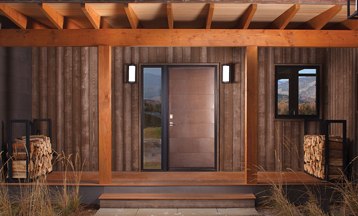
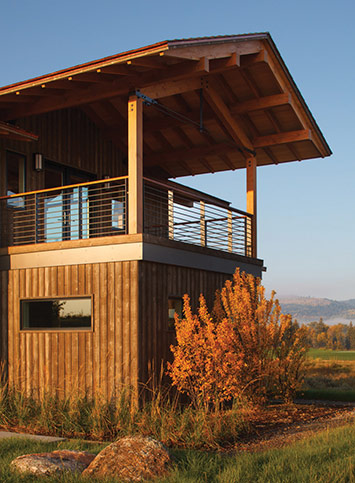
The exterior does not have a broad array of materials— primarily wood, glass and architectural concrete with some metal accents—but it is the first home in 3 Creek to use architectural concrete on its exterior. “The concrete was a challenge for 3 Creek to approve, but through an extensive sampling process, they’ve come to appreciate it,” Burke says. “It’s opened up a nice addition to the materials palette that others can now use.”
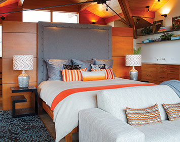
The master suite commands views in four directions. A subtle mix of elements—warm, dark wood walls, woven fabrics and exciting colors—adds both architectural and textural interest.
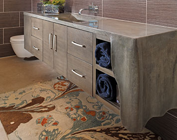
The fluid look of this poured concrete countertop plays against its intrinsic nature. The exquisitely shaped concrete fold adds an artisanal touch in connecting the patterned rug to striated tiles.
While the architectural concrete—stained a mottled grey/brown—is the most unique material of the home’s exterior palette, it’s the glass that’s most noticeable, from both inside and out. The areas facing away from the driveway are almost entirely glass. “When you’re looking in the obvious directions, you don’t really see any other homes or intrusions on the land,” Burke says. “Of course we had to capitalize on those views.”
The home was designed with two main living spaces: a 1,000-square-foot combined kitchen, living and dining area on the ground level and an 800-square-foot upstairs master suite. Both are open and have at least one wall that is floor- to-ceiling windows. On the ground floor, the entire southwest corner is glass. Munger Mountain and the southernmost edge of the Tetons dominate. Upstairs, the western wall of windows frame Glory Bowl and the range as it runs north.
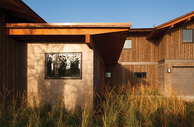
Wanting the newly built structure to look seated in the landscape was a challenge solved by using native grasses, plants and onsite hardscape.
“With all this glass, there’s a great connection between the inside and outside,” Burke says. Which, of course, made Binger’s job of creating a warm space challenging. “Understandably, the client wanted to pull in from the views, not distract from them.” So Binger did what she recommends to all clients looking to warm up spaces: “I used deliciously textured fabrics, selected sizable wool rugs, chose tiles with soothing colors and created a family of wood tones that complemented the concrete floors,” Binger says.
A sofa and armchairs are upholstered in woven patterns. “Printed patterns can be flat, but the reveal in woven patterns assists in warming a space,” she says. As do the fabrics themselves: The sofa is chenille and invites you to curl up on it.
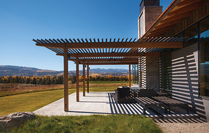
The south-facing patio trellis provides summer shading and lends an artistic nuance to the exterior.
While the floors are concrete, the walls are paneled in fir, and the ceiling is hemlock with a clear finish. Kitchen cabinetry is sapele (an African mahogany). Bathroom cabinetry is quartersawn white oak. “It’s all very clean,” Burke says. Jed Mixter, a principal at Two Ocean Builders, the valley firm that built the home, adds, “More modern projects are always challenging because the lines are crisper and the geometry more exact. There’s really nothing to hide behind.” That said, Mixter’s favorite part of the home is the paneling in the main living space. “It’s simple, but has as much character and depth as reclaimed timber,” he says. Albeit very different character and depth than rustic materials like reclaimed timbers and logs. “It’s not that rustic is out, but we’re seeing more and more clients asking for this ‘mountain modern’ aesthetic, which is a fun departure,” Burke says.
