> Story by Kirsten Rue
> Photography Courtesy of Bohlin Cywinski Jackson, Latham Jenkins, Nic Lehoux, and Paul Warchol
The historic homesteads of Grand Teton National Park have attained the same iconic status of the mountains looming behind them. Buffeted by winds, the sweep of snow, and a century of blazing summers, their wood is silver, beams of sun bar wizened floorboards, grass grows from their roofs, and porches lilt precariously on spindly beams of lodgepole pine. To some, their romance is in decay, but that view disregards what they have to tell us.
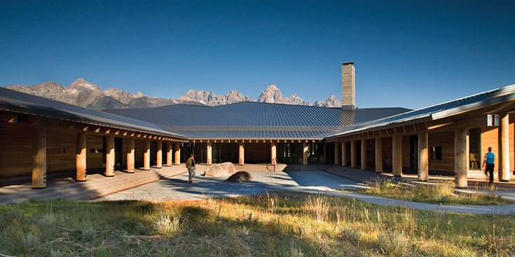
Through their design, two recently built structures in our own backyard craft a new story about national park wilderness and our powerful encounters within it. The Craig Thomas Discovery & Visitor Center and the Laurance S. Rockefeller Preserve are on the vanguard of what national park architecture can be: Representing, in one case, a public-private partnership and, in the other, a significant gift of private land and resources, these modern structures draw on the landscape and inculcate a sense of wonder for a whole new generation of park visitors.
Frame
Despite their undeniable poetry against the raw shear of the mountain range, original homesteads lying within Grand Teton represent an urge more basic: slapping up four walls and a roof against the elements. Katherine Wonson, cultural resources specialist at Grand Teton National Park, explains that, “People built here in order to survive. It’s vernacular architecture in its prime, which is non-architect designed.” This leads to the fiercely idiosyncratic barns and cabins that pepper the open vales of the park—touchstones such as the Moulton Barn or the Cunningham Cabin gained their distinctive look from the individuality of their composition.
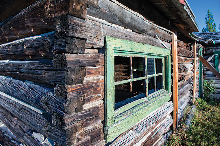
In the first wave of tourism to the valley, the era of the “dude” was inaugurated, personified here by the Bar BC Ranch. Hewn to mimic the stirring lyricism of the original homesteads, the guest cabins and outbuildings of the ranch date from 1912 onwards, but far more closely resemble rustic structures of the 1890s. They were built via hog trough construction, a method Wonson calls “over-the-top simple.” She points out that this same simplicity and roughness was entirely intentional. Walking a fine line between “working ranch” and an “overly pioneer aesthetic,” this era of building was the first of many waves in the park to consider the experience of the visitor.
A New Experience of View
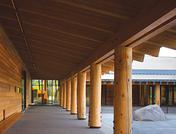
In their own ways, both the Craig Thomas Visitor Center and the Rockefeller Preserve take some crucial cues from park structures, even while encapsulating differing goals. Ray Calabro, architect and project manager from Bohlin Cywinski Jackson, explains the entrance of the Craig Thomas Center like so: “You’re in this vast landscape with these incredibly tall, vertical mountains and this flat valley and you come to a place that feels quite familiar in a way. It feels like a porch, the lodge. It has a scale that makes you feel comfortable.” The intimate scale broadens as one enters the building, adding “something that I haven’t experienced before—not only in National Park Service architecture—but in some ways in American architecture.” That added element? An experiential quality.
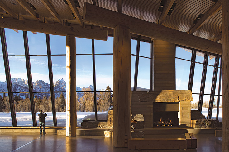
Wonson notes that in this pullback from the view, the Craig Thomas Center gestures towards Mission 66-era park architecture. In Grand Teton, Mission 66 is exemplified by Jackson Lake Lodge. “You walk in and originally the staircase was actually even more narrow than it is today. … You were supposed to have this experience where at first you felt shut in.” At the top of the stairs, however, one is no longer sheltered; the entire range is revealed in a sudden evaporation of indoor/outdoor borders.
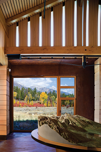
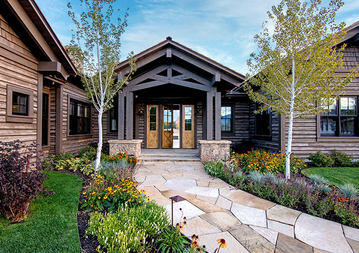
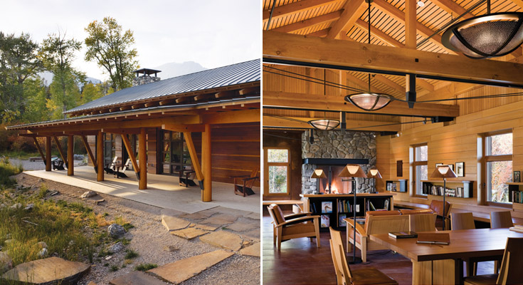
This same intimacy of approach is felt in the porch-style entrance of the more modestly sized Rockefeller Preserve. “It is an L-shaped building … and two gable forms have been pulled apart. In between those two principal gable forms is a very low-slung porch roof,” says Kevin Burke, principal of Carney Logan Burke Architects. Mimicking the traditional gabled roofs of homesteads, this initial entrance into an interpretive experience of place is human-sized, drawing back from the grandeur of the national park’s open spaces for an effect more personal and reflective.
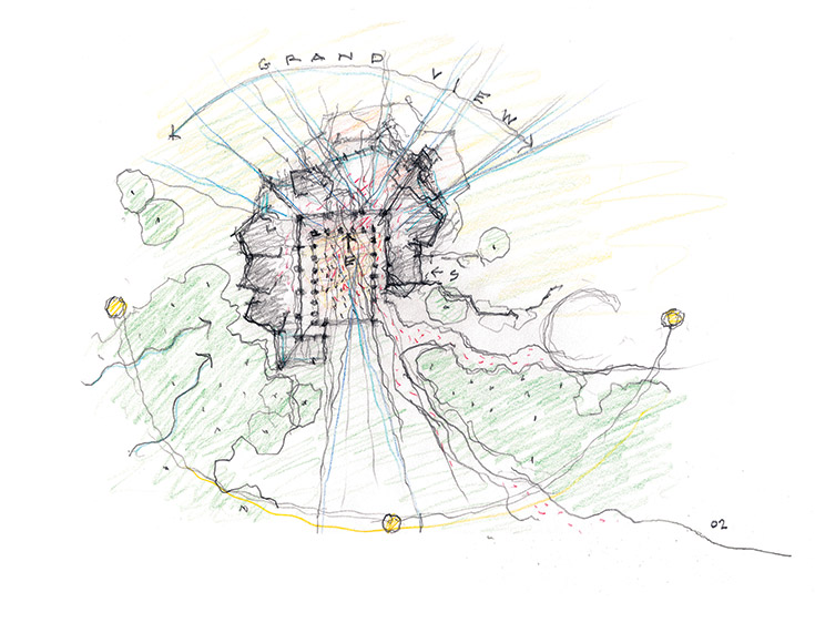
For both buildings, a deliberate choreography drives the visitor experience—architectural choices inform and illuminate the richness of the Teton views. In fact, a dance with the view itself was a crucial design focus for BCJ’s team. Calabro describes the approach sequence to the visitor center from a removed parking area along the meadow path, across the colonnaded courtyard, and through the front doors: “You’re compressed in a more narrow vestibule with a lower ceiling, and then as you come through and into that big, light-filled space, the roof kicks up and the view is re-presented to you in that way. … There’s a little bit of drama that we set up as part of that.” In fact, the slender steel mullions of the roof support an echo of the peaks to the west; the line soars and guides the
gaze upwards.
In the case of the Rockefeller Preserve, Burke notes that a 3-D diorama and map greet visitors after entry. Beyond them, sun filters in, as does a beckoning north-facing peak view. Anticipation builds here, he says, as visitors grasp the ecosystem they are about to encounter on the preserve’s 8-mile trail system.
Moments of Contemplation
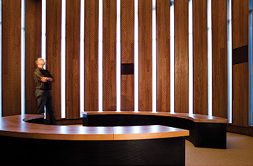
The best architectural choreography does not only reveal and guide—it also makes us feel. Within the Rockefeller Preserve, sensory exhibits emphasize the history of the Rockefellers themselves and Laurance’s mission to cultivate an environmental awareness that park visitors will carry home. Chief among these experiences is a chance to sit still and simply listen within a chapel-like space. The curved room silences with acoustic-dampening ceilings while a soundtrack of rain patter on leaves and birdcalls tunes us to the frequency of the outdoor environment. The tone here is introspective. Burke explains, “Because the light levels are dimmed, it is very evocative of an old barn where boards have pulled apart and you see the sunshine coming through the slats. There’s a really powerful feeling in that space.”
BCJ worked closely with Ralph Appelbaum Associates, the interpretive designers for the Craig Thomas Center, to completely meld the architectural experience with the interior exhibits. Calabro and his team recognized immediately that, for many, their time within the center would provide the primary door to understanding the park. He describes how the exhibit design was based on creating a “grand hall” that could encompass educational, contemplative, and social gathering spaces. Rather than a series of separate rooms, the interpretive spaces of the hall are reminiscent of canyons, allowing visitors to focus both inwards and outwards.
© Paul Warchol
All of the surfaces, even the floors, are activated with potential meaning; on the back patio, the precise alignment of each visible Teton peak is introduced via inlaid lines that list names, elevations, and stirring quotes from famed mountaineers.
Neither building operates as visitor centers commonly do—ushering us from box to box and enclosing us as we absorb information without its context. In contrast, the architecture is partner to the program, and we remain linked to the exploration that beckons right outside the window.
Structure Born of Environment
While a reverence for place certainly characterizes our experience within these buildings, their modes of construction draw most directly from the lineage of the park’s built environment.
The tumble of the Tetons’ igneous rocks seems at home in the Craig Thomas Center’s courtyard, where two large, granite boulders emerge from a bed of concrete—one of Calabro’s favorite aspects of the completed building. Each one was hand-selected from a Wyoming quarry and then carefully oriented. “We had this idea about these boulders in the courtyard being pieces of the Tetons that people could touch.”
© Nic Lehoux
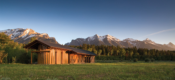
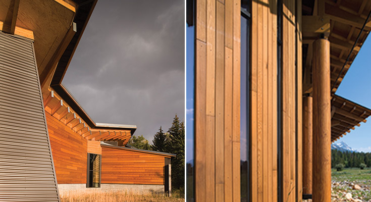
Rockefeller Exterior: Custom-composite wood and steel king post trusses support a sawn-timber frame roof—a subtle homage to the original JY Ranch’s boathouse.
© Nic Lehoux
The beams within the center invoke the same emotion. The Forest Stewardship Council-certified Douglas fir beams were also hand-selected. Calabro says of their effect, “The tall columns that you’re standing in are a great forest, and you have this prospect out over the meadow and you see the mountains. There’s a composition there and a way of connecting people to the landscape that is important.”
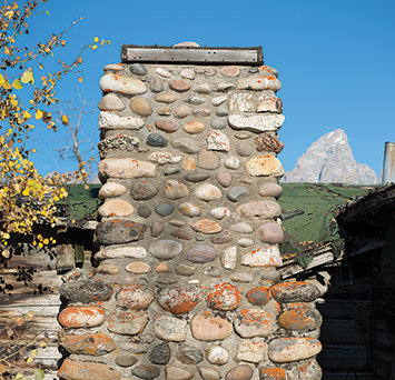
As the first national park structure to gain Leadership in Energy & Environmental Design Platinum status, the Rockefeller Preserve’s team was required to source its materials from a radius no greater than 500 miles from the site of the build. Choices were equally constrained and considered. Burke describes a process of harvesting the fireplace stone on-site and sourcing “highly crafted and refined” western red cedar. “The material palette is kind of sparse in a way. … If you think about those early park structures—any one of the Park Service’s—they’re utilizing what’s available to them in that place.”
One look at the Bar BC’s hand-daubed river rock chimneys certainly reflects this.
Both architecture firms were also serious about something else: allowing for a natural wood-weathering process. The western red cedar siding on both buildings (clear-heart grade, in the case of the Craig Thomas Center) will be left untreated. As years pass, they will gain the same patina as the heritage barns that already distinguish Antelope Flats—a variegated hue that takes on the blush of sunrise and sunset.
New Solutions for Old Problems
Snow loads and the sapping effect of the bright western sun have been eternal challenges for builders in Jackson Hole. Both architecture firms approached these concerns with the power of technology and simplicity to create environmentally sensitive solutions.
The Craig Thomas Center’s ridged rooflines serve double duty: distributing the snow load evenly while the steel supporting the window wall provides a louver system to shade the interior of the center. Shield walls allow snow to deposit on concrete instead of directly on wood, and a wainscot around the perimeter of the building helps to collect snow as well, leading to a building that is as durable and maintenance-free as possible.
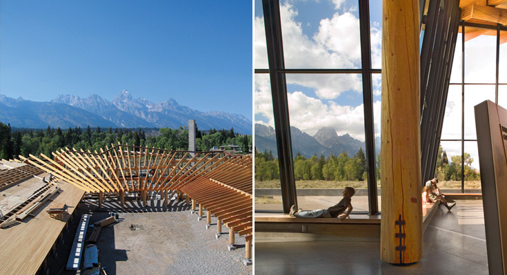
“We thought it would be nice if you could sense where the loads were by spacing the beams closer together only in those places, so the structure sort of tells you a little bit about what it’s doing and what it’s supporting,” Calabro says.
For Burke and his team at the preserve, the goal was a building that could be day-lit without sacrificing the delicate technologies at work in the interpretive displays. To meet this challenge, Burke says, “we did extensive daylighting studies early. That’s partly why you see the big, broad 12-foot overhang on the east window. One, it helps protect the architecture from all the snow, but it also helps eliminate a lot of daylight coming through.”
Frit glass in the Family Story Gallery reduces 40 percent of the sunlight transmitted and allows all exhibits to function as intended. “Again, it was this really tough interplay in terms of us wanting to create a space that was naturally day-lit and ventilated, but with a program that didn’t want those things. We had to grapple with that in just about every single space we had,” he adds.
Situated on lots that had already been disturbed by human presence, both facilities are surrounded by reclaimed and re-seeded vegetation; species like sage and hawthorn have taken root again. Sitting quietly on the land, the two buildings are holistically connected to it.
A Leap Forward; Look Backwards
Wonson points out that Grand Teton National Park’s historic buildings are not going anywhere. They represent a vital legacy that belongs to park visitors in the same way that the glacial lakes, wildflower meadows, and bugling elk belong to them.
“We have 45 historic districts and about two-thirds of them are in use by park or partners,” she says. The other one-third comprises homesteads and structures that have since been turned over to the Park Service. “They’re some of the most beautiful properties and they have really high integrity,” but it can be difficult to maintain each one. In autumn 2014, the park put forth a historic preservation plan to address some of these concerns; it looks forward to future public-private partnerships that will breathe new life into potentially neglected structures.
In the preserve guest book, page after page of scrawling script attests to the building’s resonance. “Although the landscape will change constantly, this beautiful center will hold fast for so many people to reflect and inspire generations,” writes one family. “The architecture and place are perfectly matched.”
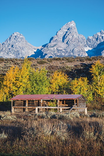
Cultural Inheritance: Listed on the National Register of Historic Places, the Bar BC Ranch is just one of the park’s historic districts with conservation efforts underway. Its founder, author Struthers Burt, referred to Grand Teton National Park as “a museum on the hoof.”
Calabro describes the joy of going incognito and observing visitors in the space he and his firm designed: “No one knows that I was the architect. Standing by the entry and watching people as they come in—the look on their faces; their jaws drop. The kids immediately run to the exhibits. Seeing that kind of reaction is so satisfying as an architect.
“The parks are such an important part of American history and culture. They are a resource that is precious and should be valued. Certainly our contribution to the park is one that I hope heightens that sense of experience and value for people. It’s immeasurable.”
