WRJ DESIGN
WRJDesign.com
ARCHITECTURE
RICHARD KEATING
KeatingArchitecture.com
LANDSCAPE ARCHITECTURE
VERDONE LANDSCAPE ARCHITECTS
VerdoneLandArch.com
Story By
Katy Niner
Photos By
Ed Riddell
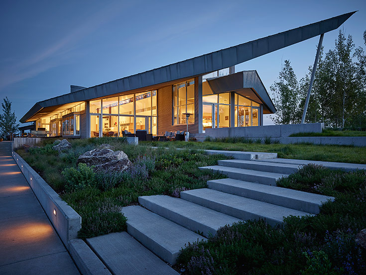
Is contemporary intrinsically cold? That was the concern of a couple when they found an architectural masterpiece in Alta, Wyoming. Designed by skyscraper architect Richard Keating, the striking structure felt like a stretch for them, their East Coast roots and their predilection for mission-style furniture. “I thought it was absolutely gorgeous, but the house was essentially all steel, cement and glass,” one of the homeowners says.
They turned to their friend Rush Jenkins, CEO of WRJ Design, for advice. His counsel ultimately became the deciding factor in their decision to purchase the 70-acre estate.
“Our caveat was: Can modern be warm?” the homeowner says. “Rush assured us that it can be. He told us: ‘I promise you I can make your house feel like a home.’ That’s what convinced us to pursue a purchase.”
From the moment Jenkins glimpsed the house—cutting a daring silhouette above the rolling Teton Valley—he knew it would become a capstone project. Drawing on his background in both landscape architecture and interior design, he believed the residence represented a singular opportunity to design a holistic schema in communion with the setting.
“We consider every element in our design by envisioning a world that transcends the distinct components,” Jenkins says. “Everything must come together to create a calm, tranquil environment in harmony with their surroundings.”
Contextual complement
Honoring Keating’s angular architecture and its roofline reflection of the jagged Tetons, Jenkins imagined the interiors as a warm complement by channeling the wheat fields below the bold home. Also conscious of context, Keating had referenced Alta’s agrarian setting by using the corrugated metal sheathing silos and sheds to create a clean, minimalist stage for an interior vision.
Jenkins and WRJ Design Director Nida Zgjani rose to the occasion with an eloquent plan that proved worthy of the architectural statement Keating had made. Upon installation, Keating wrote Jenkins: “I wanted to relate how much I appreciate your firm’s work and the quality of interior design that the house never achieved in the prior owners’ time. … Please pass on to your team my appreciation and thanks.”
Harmony is the essence of WRJ—the foundation of our design philosophy.
~ RUSH JENKINS
Keating had sited the house in a particularly dramatic location, with endless views west and south. By his placement, the house serves as an amphitheater for nature: storms rolling in from the west, the wind whispering through the tawny waves of wheat, the fields changing hues with the seasons. “The house is immersed in the beauty of movement and seasonal change,” Jenkins says.
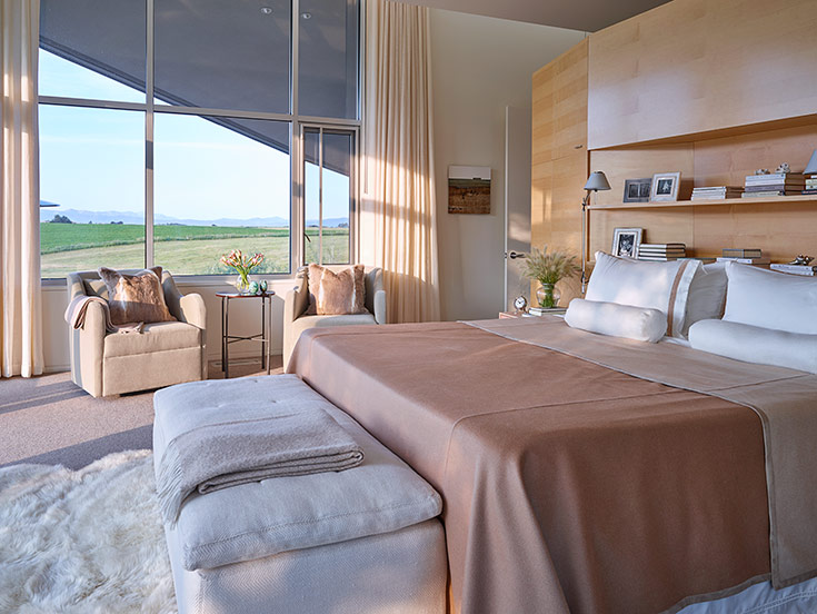
Thus inspired, he pulled this palette inside: the whites and grays of winter as upholstery, the wheat color from the fields as wood finishes, the azure of the endless bluebird sky as accents, the rich brown of the fertile soil as anchoring elements.
“The architecture is obviously a statement,” Jenkins says. “The interiors must communicate with the architecture, but also the landscape. All three elements must speak to each other and, through this open dialogue, achieve an overall harmony. As a designer, I consider the full circle: the architecture, the landscape, the interior. If you get that dynamic right, the house feels harmonious. Harmony is the essence of WRJ—the foundation of our design philosophy. It’s an extraordinary opportunity to have a place where you can retreat and feel nurtured.”
Graceful sanctuary
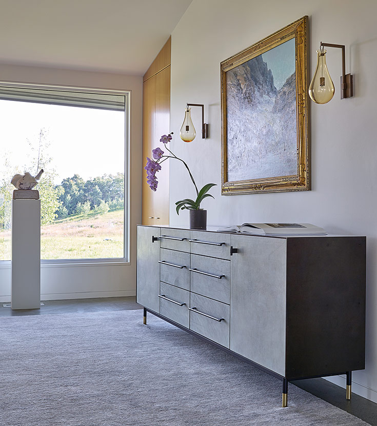
Attuned to art, Jenkins incorporated key pieces from the homeowners’ collection, including a landscape painting by their friend and Teton Valley neighbor Scott Christensen. The lustrous oil painting now lives within the entrance hall, its rich composition tying into the textured leather-and-bronze BDDW console—one of the first pieces picked for the house—and a pair of bubble sconces from Paris found at Ralph Pucci in New York. This serene vignette serves as an interior threshold, setting the tone for the rest of the house: for the majesty to unfold in the open living area, for the tranquility achieved throughout the interior. “Like the unfurling mystery of nature, the house reveals itself in moments,” Jenkins says.
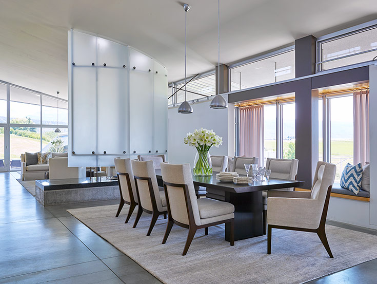
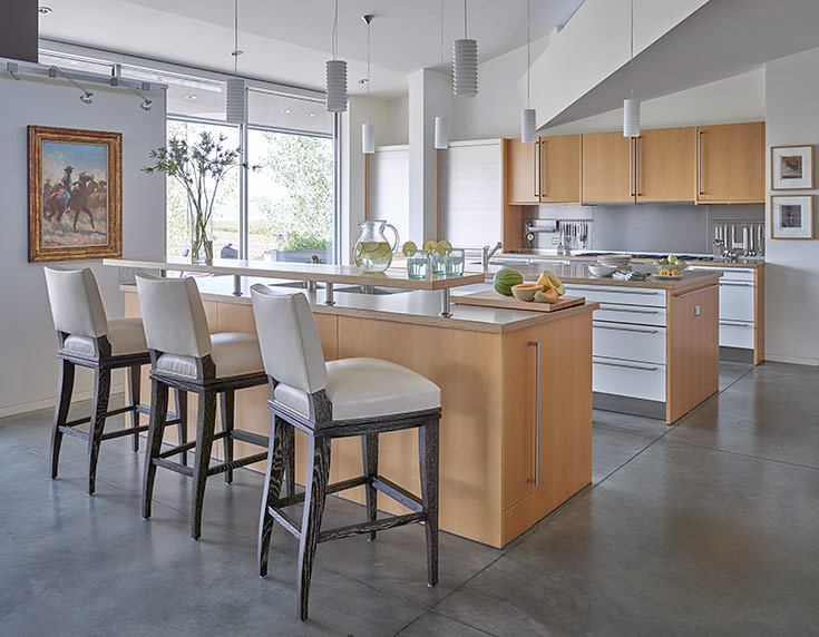
Generous philanthropists, the homeowners needed living spaces capable of staging charitable events with many guests, but also cozy evenings with their family. The resulting living room flows with grace between seating and dining areas. Honoring their more traditional past, Jenkins chose several key pieces that translate the gravitas of classic furnishings into sleek shapes, such as the Holly Hunt seamless dining table in a deep walnut and the June Ho game table with its solid bronze trunk and white top.
To complement the concrete floors, Jenkins blended in gray, bamboo-silk rugs by Ralph Lauren, low-pile masterpieces that nearly disappear. Rife with such careful pairings, the home feels harmonious. “Your home is your sanctuary, the place you go to escape the troubles of the world,” Jenkins says. “Your home should rejuvenate you.”
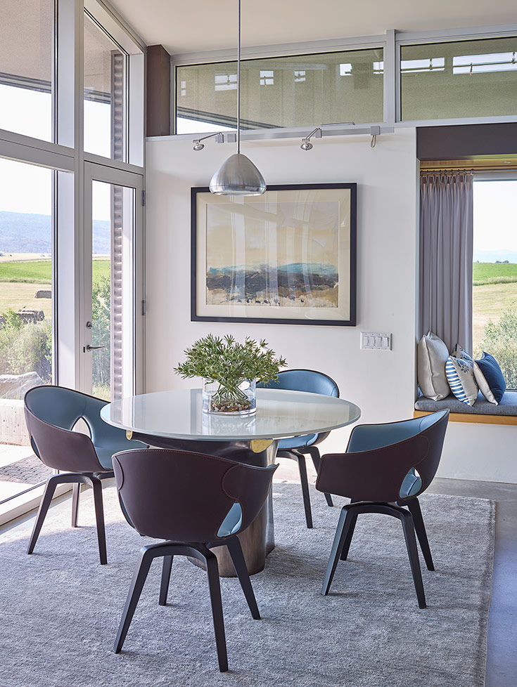
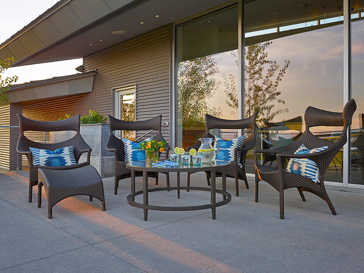
Two enclaves, in particular, issue invitations to relax and restore. The first is the circle of Janus et Cie handwoven armchairs on the veranda, ergonomic designs that encourage sinking into (no pillows necessary). Guests can sit, sink and soak up the vista with a cup of tea or glass of wine, listening to the owls perched on the fence posts, tracing the pathway that leads to a fire pit imagined by WRJ’s COO, Klaus Baer. The other memorable moment lives inside, in the window bays Jenkins upholstered and plumed with pillows from Turkey. Loro Piana silk-and-linen drapes frame the bay, creating the perfect place to page through a book.
Luminous landscaping
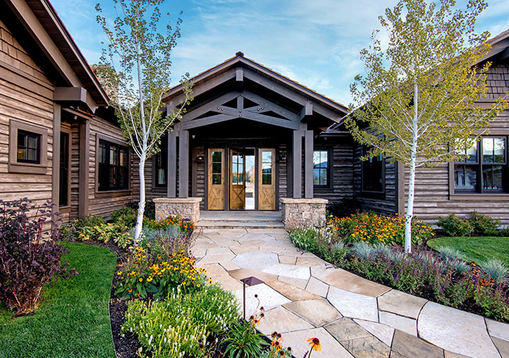
Echoing WRJ’s approach, Brannon Bleggi, of Verdone Landscape Architects, set out to ground and soften the concrete, steel and glass structure without tethering its transcendent architecture. “We wanted to make it seem like it was floating in a sea of native grasses and plants, so that you see bits of the concrete poking up above, like waves lapping against a boat.” This sense of soft movement honored the structure’s form while simultaneously better integrating it with its surrounds. “The big thing was to showcase what the site had to offer,” Bleggi says.
The original overgrown shrubbery had made the house feel dark and cold, so Bleggi prioritized light. Rather than break up the geometric lines of the structure itself, he allowed filtered sunlight through aspen stands to soften the angles.
The element of water was further cultivated by revealing the brook to the south, a natural waterway previously heard but not seen. “We went in and surgically plucked out and poked holes within view of this mass of willows. We opened up peekaboo views into the brook which changed the whole liveliness of the house.”
Like WRJ, Bleggi considered texture and palette. “The native plants played well with texture, while allowing sprinkles of color to rotate throughout the seasons.”
Your home should rejuvenate you.
~ RUSH JENKINS
Such intrigue endures: Having lived in the finished home for several years now, the homeowners feel entirely at peace in the space. The warmth they hoped to see in the final product was actually achieved throughout the process. “All projects like this are fun, but there’s always a certain amount of stress involved,” the homeowner says. “This project turned out to be just fun. Rush and Klaus removed the stress for us.”
