Colleen McFadden-Walls Interior Design
CMWid.com
Kitchen + Bath
Peppertree kitchen + Bath
peppertreekitchen.com
Appliances
Mountain Land Design
mountainlanddesign.com
Story By
Kelsey Dayton
Photos By
David Agnello
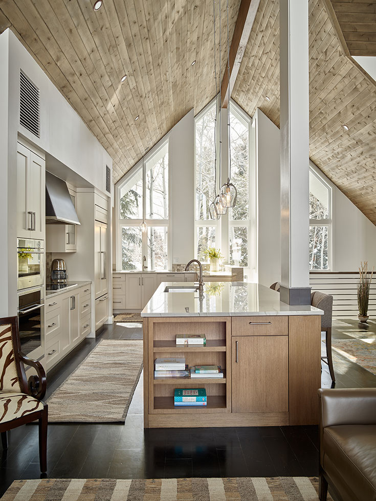
The wife wanted contemporary, but the husband wanted to keep the rustic flavor of a mountain house, says Walls, owner of Colleen McFadden-Walls Interior Design, who was not intimidated. “It’s my job as a designer to define the overall aesthetic by listening to my clients and then to bring it to fruition through all the little details … in this case sophisticated mountain contemporary.
Walls specializes in remodels and took the helm for revamping the 3 Creek house a few years after the owners moved in. The original finishes were unattractive and dated, and she was working on a tight budget with a time crunch. The homeowners vacated the house on January 15th and planned to move back in on July 1st—and Walls needed to gut the entire house in the meantime.
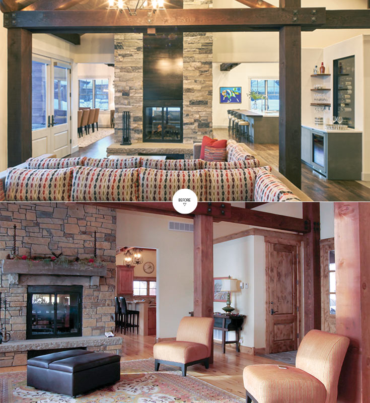
She knew immediately when she entered the home that she would need to update the color scheme, which included a “difficult red.” She envisioned replacing it with grays and warm browns. Now, she says, “everything is warmer yet lighter and brighter.”
Walls also scoped out ways she could make the space more functional, but also less generic. The staircase, for example, was not only unremarkable and bland, but it left unused space at the top landing. She redesigned an iron railing and added a mini office space on the landing with a desk and a computer anyone in the house can use. It was a small but noticeable change. “The whole area was very uninteresting from bottom to top,” she says. “Artwork and a colorful area rug also added a much-needed punch.”
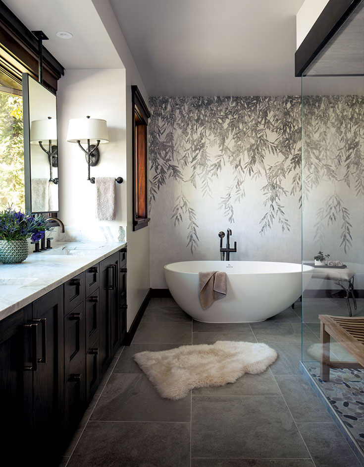
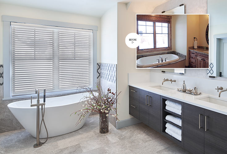
While Walls added touches like these throughout the home, she focused primarily on the kitchen and the bathrooms for the biggest transformations. She and her team, Rosanna Mitchell, Kathie Harrington and Lacey Stalter, remodeled all four full bathrooms and a powder room, explaining, “The bathrooms were incredibly dated, and they really needed a complete face-lift.”
Luckily, they all had good layouts, so existing floor plans were kept to avoid the cost of re-plumbing. Walls did add freestanding bathtubs to replace the existing “unsightly” drop-in tubs. Her team designed bathrooms that were functional, relaxing and modern, but not antiseptic. They used natural wood and veneers with elegant finishes to tie the spaces together and create a cohesive fit with the rest of the home. In the end, the bathrooms were entirely refreshed.
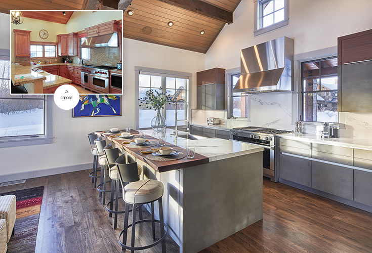
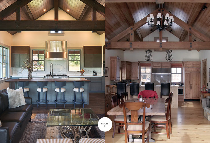
The kitchen underwent the home’s biggest transformation. Douglas Rey, a designer who assisted Walls on the project and represents Mountain Land Design and Peppertree Kitchen and Bath, continued the melding of modern and rustic with the appliances and cabinetry in the kitchen. “We used clear, linear designs, but with natural finishes that are cohesive with that mountain-home setting,” he says.
The kitchen cabinetry is stone by Leicht, a German company that Peppertree sells. The real stone offers understated tones and adds texture. The open layout provides space for the owners, who like to cook. The appliances, which include items like a combination steam oven, are by Miele, a brand with a modern aesthetic. The kitchen bar, a solid, single slab of walnut with a live edge, continues the blend of contemporary and rustic.
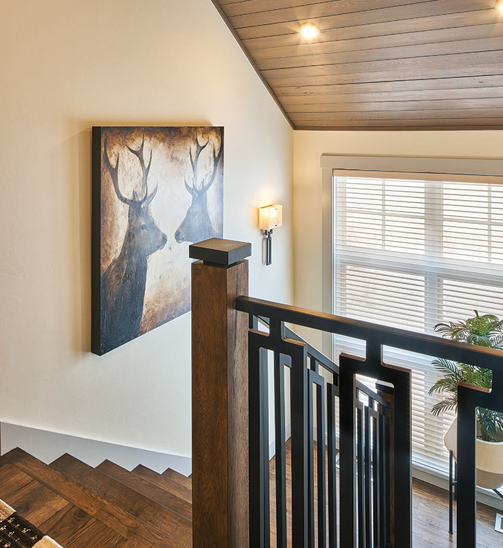
Walls went with dark brown stain on the floors and ceiling beams throughout the house, replacing the unattractive blonde floors and red beams. Gray stain was chosen for the ceilings to complement all of the changes, including the new, gray fireplace.
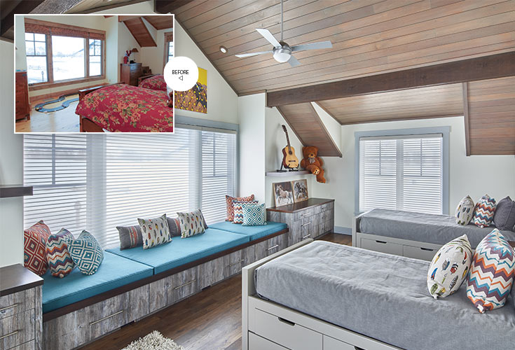
The kitchen is the most striking change in the home, but Walls also updated the bedrooms. She and her team even added a small wine room—Rey’s favorite update to the home. With limited space, they framed and repurposed a closet adjoining the great room, but added glass so it could be seen.
“I think that was the single biggest improvement in the home,” Rey says. “The kitchen is dramatic, but the wine room really adds something substantial.”
Such details helped fully transform the home, and Walls’ happy clients moved back in on schedule. A job well done.
