Angles and Lines
+ Story by Alisan Peters
+ Photography by David Agnello
ARCHITECT
Stephen Dynia Architects
dynia.com
Three walls and a roof have been around since the beginning of time, and that’s an idea that captivates Jackson-based architect Stephen Dynia. He’s probably noted dozens of such sheds during his drives across the Wyoming landscape to his satellite office in Denver. “The shed is a simple form, one that was adapted quickly as standard ranch architecture, because,” he says, “it’s effective.”

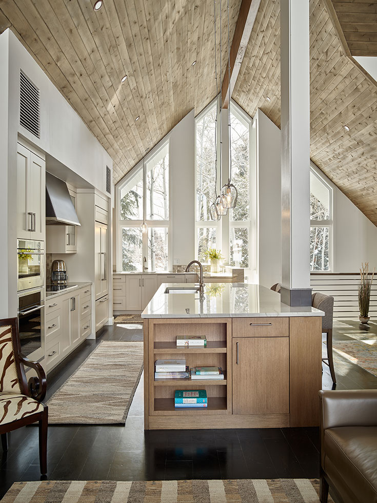
The shed roofline, deep eaves and floor-to-ceiling windows all have a role to play in this elegant home in Wilson. Architect: Stephen Dynia Architects
In this Wilson home, Dynia has taken two shed forms and placed them end-to-end, one opening to the north and west to capture views of the Teton Range, while the other opens to the south with its Wyoming meadows and braided rivers in a land trust easement. The two sheds are fitted together in a “sort of embrace,” as Dynia explains it, the interior reaching—via the angles and lines of the materials—to the exterior spaces.

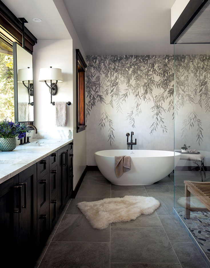
The headboard wall structure defines one wall of the master bath.

Floor-to-ceiling windows allow for spectacular views as well as solar heat gain.
“This house is rather carefully designed,” Dynia notes, “so as to reinforce this central theme of ‘embrace.’ That concept is enhanced by keeping a discipline of thought throughout the materials used, and as a result, the nature of the house is enveloping while still being open to the nature that surrounds it.”

The corrugated ceiling piece is backed with acoustic material to manage sound, an artistic and streamlined solution.
Once inside, circulation moves along a “functionalized wall,” the architectural spine that extends and organizes the public spaces—entry, kitchen, dining, living room and spa—and helps emphasize indoor/ outdoor continuity. This nexus, where the two shapes join, opens via a skylight to a view of Jackson Hole’s big blue sky.

The mahogany display shelving is the termination point of a hallway bookcase, while a wall in the living room provides an area for a crackling fire.

It all comes together along this spine-like hallway. Public spaces are connected, and the embrace inherent in the two-shed design is celebrated by the surprise of a skylight.
Necessarily, the two metal roofs are canted, both to capture views and light, but also to give a sense of breath, of movement from inside to out. Signature Dynia touches include dynamic walls, with both sides functionalized: a two-sided fireplace, say, or a run of touch-latch closets that culminate in display space and a bookcase, or peep-through points that may be as large as a door or as slivered as a castle’s arrowslit.

The long run of this exterior wall is made dynamic by a mix of architectural materials and its intriguing articulation.
Mahogany is the main wood used, while rusted metal, poured concrete and glass round out the materials palette. A silver, corrugated ceiling piece is suspended from the kitchen ceiling and mounted over acoustical backing. All in all, this quiet enclosure is likely to serve as shelter for a long, long time.
