+ Story by Alisan Peters
+ Photography by David Agnello
Sometimes, inspiration flows from what you don’t want to do. In the case of this space-bending guesthouse in the Wilderness Subdivision, the owner wanted to explore a guest option that conveyed a more organic orientation than her traditionally styled home. As an art collector, her eye for structure, color and style found perfect symmetry with architect Nona Yehia of E/Ye Design.
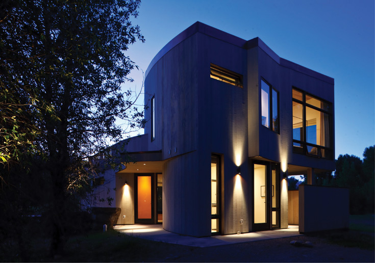
Silhouetted against a twilight sky, the outline of this guesthouse has a cloudlike quality. The punch-out window seemingly opens to the natural world.
“We set out to design this new living space by aiming to play off elements of the main home,” says Yehia. “It was all about trying to get the greatest spatial variation in that smallish footprint.”
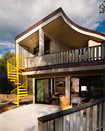
This circular staircase provides quick access to a ground- level pond just off the patio. Its startling color gives life to the more neutral exterior and draws the eye to the seductive curve of the roof.
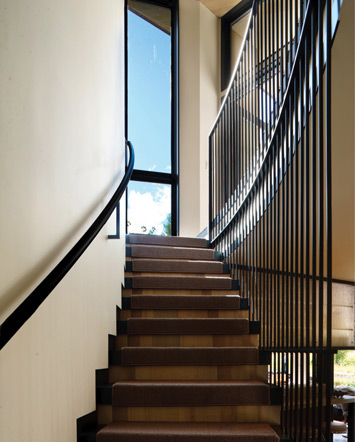
A steel staircase is carpeted and accompanied by steel railings that lead first to the view window, then turn a corner into the sleeping area.
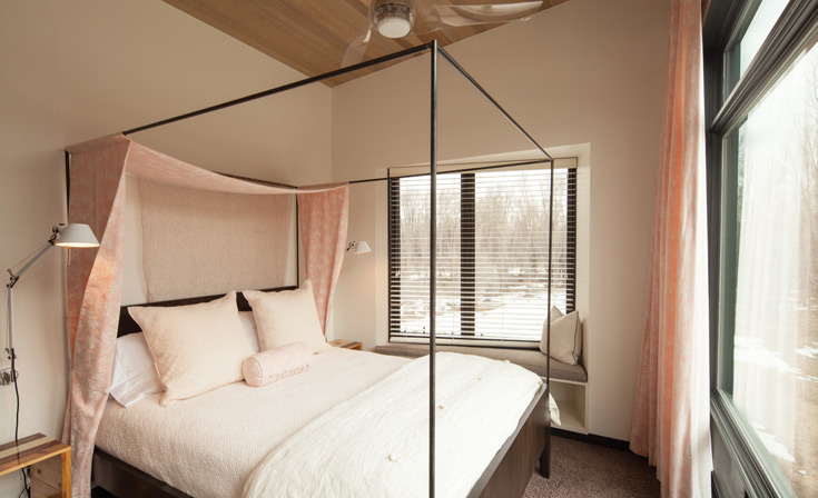
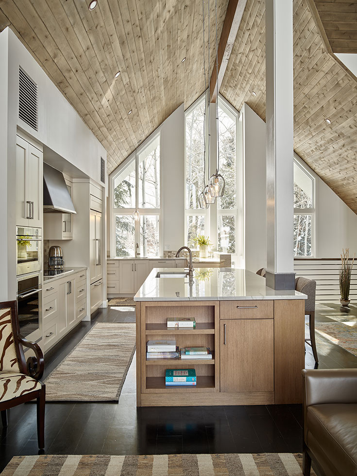
The sloped ceiling invites the eye to take in surrounding mountain views, as does the window seat in the punch-out wall.
Yehia settled on materials and visual links to some of the main home’s stronger elements. For instance, the traditional home’s exterior is board-and-batten gray cedar; Yehia opted for tongue-and-groove gray cedar. Punches of yellow, both inside and out, harken back to the homeowner’s painted front door, and strategic windows give a smallish space breathing room.
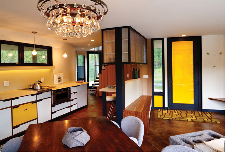
Attention to detail was key to maximizing the opportunities of the main floor. Color, materials and careful selection of elements created a space that is warm and inviting, yet not shut off from the outdoors.
“On this project, I actually got to do what I love best, which is push traditional elements into new configurations,” Yehia continues. “Using elements like sloped ceilings on the top floor, broad sliding doors to the outside and a circular staircase to the pond opened up the interior and gave it a more organic, connected-to-nature feel.”
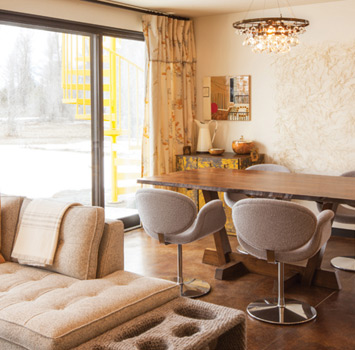
A neutral palette is punched up with yellow pillows and patterned draperies. Furnishings are comfortable, sleek and modern.
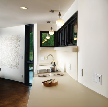
Directing the eye to follow the clean lines of the space adds to a sense of movement. The arrow window between the end of the kitchen counter and the dining area acts as a caught breath, allowing views of exterior curves and natural surroundings.
Carrying the outside in, Yehia provided a sheltered outdoor shower. And interior designer Emily Summers added finishing touches whose composition or presentation echoed the mountain views outside.
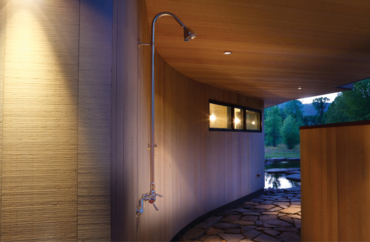
Freedom and privacy are combined in this quiet alcove with its rain-shower water fixture.
“It was a great project,” Yehia concludes. “There’s a very real sense of light and air moving with you through the space.”
